
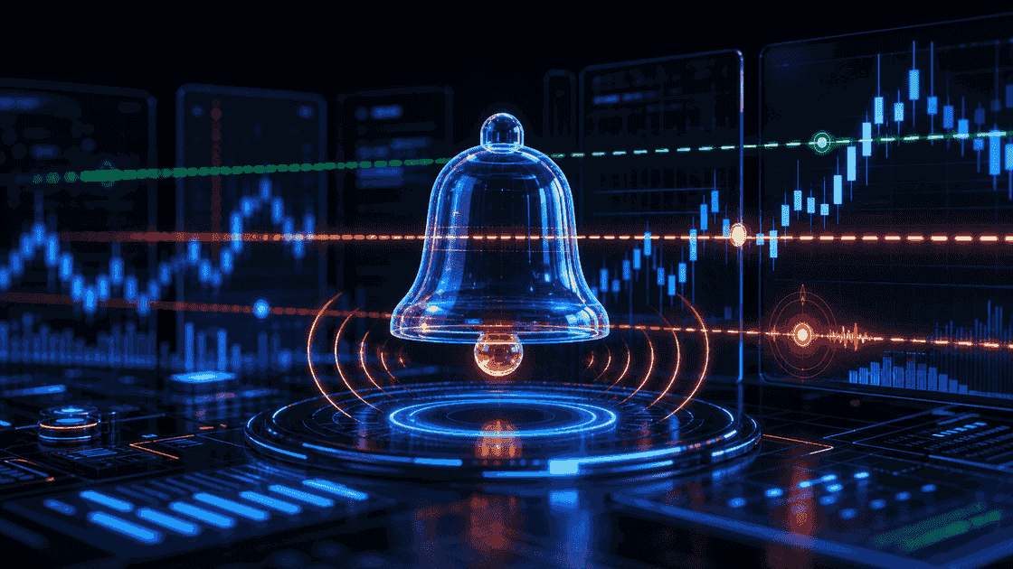
Learn how Bitcoin traps are built before the crowd feels them.
BitcoinCounterFlow teaches derivatives, liquidity, sentiment, volume, and cycle context as one workflow. The goal is to identify moments when retail and leverage crowd one side of the market, then monitor patiently instead of forcing predictions.
Liquidity, OI, funding, volume, trends, and cycle context.
Bitcoin cycles often expand for three years and reset for one.
No leverage is the default risk model for this workflow.
Wait for the crowd, then read what the mechanics are forcing.
CounterFlow is built for the moments when retail attention, leverage, funding, liquidity, and cycle timing line up. The work is to stay calm until the market gives a clear pressure setup.
Choose your path and learn at your level.
Each path curates the full library — thesis, signals, replays, and labs — filtered to your level. Start where you are.

Beginner: CounterFlow thesis
Understand why crowd behavior, cycle context, and no leverage come before every signal.

Intermediate: signal confluence
Read OI, funding, liquidations, volume, and attention as one pressure system.

Advanced: labs and automation
Turn lessons into replay practice, alerts, API recipes, and backtest templates.
Indicators are thermometers, not trading commands.
CounterFlow prioritizes derivatives, sentiment, and volatility because futures flow now drives much of Bitcoin's short-term behavior. Traditional indicators can come later, but they are not the core edge.

Open Interest
The platform treats OI as a leverage meter, not a directional signal by itself.
Watch for aggressive OI expansion while price rises. If the long side is crowded, the market can build fuel for a trap, correction, or liquidation cascade.
4h and 1d for context; 15m and 1h for execution timing.
Rising price and rising OI can be healthy participation early in a trend.

Funding Rate
Shows which side is paying to stay positioned and how crowded consensus has become.
Negative funding in a bull market can be powerful when price is falling. Very positive funding above 0.0100% warns that long consensus may be fragile.
1h and 4h for crowding; 1d to understand whether the regime is persistent.
Price rising while funding turns negative can look bullish but may not be a real reset.

Liquidations
Maps forced exits and liquidity clusters, but does not guarantee price attraction.
Use heatmap zones as possible impulse areas. The cycle and broader positioning decide whether impulse becomes reversal or trend continuation.
15m and 1h for intraday stress; 4h and 1d for larger zones.
A heatmap cluster does not guarantee price must travel to it.

Volatility
Measures how fast price is expanding or compressing over time.
Useful for timing breakouts, compressions, and regime transitions.
4h and 1d for regime; 15m and 1h around compression breaks.
Compression can last longer than expected, especially without a trigger.

Net Longs / Net Shorts
Internal flow view that compares directional positioning pressure.
Best used as a contextual layer on top of price and open interest.
4h and 1d for positioning; shorter windows only after a confirmed setup.
Directional pressure can persist in a strong trend before reversing.

Google Trends
Tracks public attention and helps identify when retail is watching the same story.
Relevant tops can precede traps, reversals, or sideways markets. Very low attention often lines up with compressed volatility before expansion.
Weekly context for attention extremes; daily checks around major narratives.
A single attention spike can fade without price reversal if leverage is not crowded.
The free course teaches the read. Labs help you practice and automate it.
Paid modules should feel like a natural next step: deeper replays, templates, model ideas, API recipes, and workflows that reduce emotional decision-making.

Full Replay Lab
Unlock the full historical replay catalog with saved decisions, reveal notes, and advanced review prompts.
Alert recipes
Turn funding extremes, OI spikes, heatmap reactions, and volatility compression into reusable alert templates.

Backtest templates
Test whether a CounterFlow idea survives historical conditions before relying on it live.

API recipes
Build custom dashboards, notebooks, and alert pipelines from the same signals taught in Learn.